Monday, March 29, 2010
short movie downloaded from YouTube that has something to do with the section, stair, or materiality and your scheme.
By having the stair as a platform elevated at different heights, it enables the audience to capture the full potential of the artworks.
I have chosen to use the construction material concrete for the stairs, majority of walls and slabs of the building as it has high compressive strength, which I believe is important when designing a public building.
The following short movie, shows how to build concrete stairs. The following link to the short movie is from the website youtube .
http://www.youtube.com/watch?v=gpdMrbRHBLU
Monday, March 22, 2010
Tuesday, March 16, 2010
7 images showing 2 draft SketchUp models
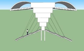
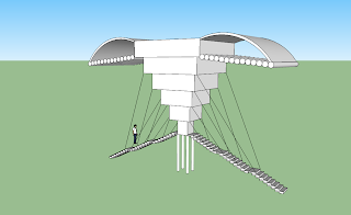
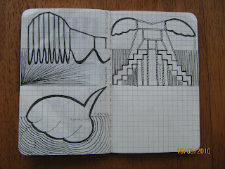
SketchUp Design 1 was based on the sketch drawing on the right page of the image shown.
The images below are of the final SketchUp design 1.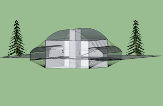
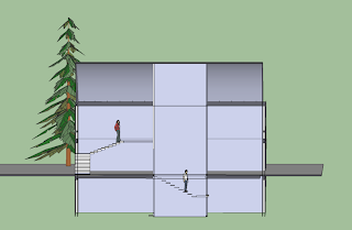
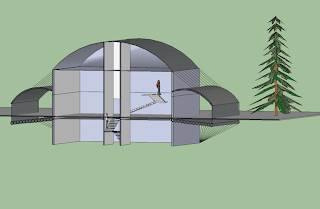
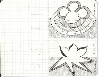
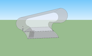 The second design (which was the model chosen for experiment 1), shows striking on the the top and freedom on the bottom.
This image shows the first stage of design 2.
The image below shows the model developed from the design above.
Tuesday, March 9, 2010
IMAGES SHOWING A WORK OF ART FROM EACH OF THE CLIENTS AND DESCRIBE IT USING A NOUN, VERB AND ADJECTIVE
Patricia Piccinini

From the series 'SO2'
Type C colour photograph
80 x 80 cm
Series of three images
Edition of 6
Courtesy of the artist and Roslyn Oxley 9 Gallery
Noun: creature
Verb: vivifying
Adjective: grotesque
Image Reference
Israel, G. 2004. Senior artwise 2: visual arts 11-12, Queensland: John Wiley & Sons Australia, Ltd, pp.193. Retrieved 4 March, 2010.Ricky Swallow
Hand finished Bronze, 2008
Edition of 2 + 1 AP
Dimensions Variable
Caravan 2008 bronze, ed. 1/3 (1-2) 35.6 x 25.4 x 27.9 cm (each); (3) 30.5 x 22.9 x 25.4 cm; (1-3) (variable) (installation) Private collection, Auckland © Ricky Swallow Photo: Courtesy Stuart Shave/Modern Art, London
Noun: freedom Verb: swelling Adjective: temporary |
Image Reference
http://www.rickyswallow.com/img/thumbnail.php?img=gallery/DSC_4237.jpg&w=202&h=148&crop=1
Richard Goodwin
The-winged-house 02
Noun: structure
Verb: striking
Adjective: floating
Image Reference
Goodwin, Richard. (2008). Richard Goodwin- Art Architecture. Retrieved March 4, 2010,
BEST PIECE OF CREATIVE WORK, AN IMAGE OF A GREAT PIECE OF ARCHITECTURE,AN ORIGINAL PHOTOGRAPH OF SOMETHING BEAUTIFUL

One of my best pieces of creative work is “the Warehouse”. Function of the building is to store goods prior to their sale or distribution with offices, a showroom, staff amenities and car park. It is a class 5, 6, 7(a) building. The building is constructed of concrete in situ.The building is located in the south-west of
Our Lady of Lebanon Maronite church, Harris Park.
Our Lady of Lebanon Church, situated in Harris Park, was built in 1978 and remains an architectural icon. It is a place of worship and seats 1800 people. The architectural style of the building is unique. Symbolism is apparent through the sacred five meter bronze statue that is situated on the point of the protruding roof where all the columns join. The prominence of the statue is part of the architectural design, drawing attention to the building as it is eye catching and it also defines the purpose of the building. There was originally a seven metre high coloured statue but due to disapproval from neighbouring residence, it was replaced. The top of the building is sculpted in the round and can be viewed from neighbouring suburbs. As the ceiling follows the roof shape, it adds a sense of immense space internally.
Image Reference
Symonds, Mark. (2010).
The image above is an original photo taken of the Sydney Opera House from Circular Quay. The prominence of the roof is evident in this image through its distinct colour against its surroundings with the water in the foreground and the sky in the background and its abstracting shapes.
The aesthetics of the building is compelling and acts as an impressive structure and tourist attraction. The Sydney Opera House is often referred to as a “masterpiece” as it is not only significant in beauty, but it is also significant in function as it suits and caters for the needs of the society of performing arts. The location gives the building prominence as the neighbouring buildings do not overpower it aesthetically.


